- did temperatures really stop rising ?
- does the halt in warming (assuming there is one) disprove climate science ?
Finding a decreasing temperature trend in data sets : easier than learning your ABC
I want to demonstrate in this post how easy it is, with a little bit of cherry-picking, to FABRICATE a trend line (we’ll presume all over this text it’s a linear trend) suited for making a exactly the claim you wanted to make before even looking at the data. Sure this claim will be very dubious, but 99% of your readers will not have the background to be able to detect the errors you deliberately inserted.
I want to look at the addressed issue from a certain viewpoint : Picture yourself to be a climate skeptic wanting to prove there’s no warming anymore. What would be the logical thing to do :
You’ll need to take the dataset showing earth’s surface temperatures and search if there’s a chance fabricating a negative trend line in it somewhere. In a set with so much noise and natural variability in it as the one of earth’s temperature, not surprisingly, choosing data suited for drawing the trend line you like best is fairly simple.
Simply draw a trend line between two carefully selected points on the graph so that you’ll have a downward trend. Whether this trend line actually is meaningful is another question which will be addressed later on. But first things first and let’s start by fabricating the trend line.
The art of shutting up on the things you don’t want the reader to know
It might sound a little silly, but when drawing a trend line, the important thing to remember is what the trend line you draw is all about. A trend line on temperature is a result of ALL processes that have an influence on earth’s temperature.
There are several datasets that try to give an estimate for earth’s temperature. As you can see in the graph below, there are slight differences between the different sets, but those differences are quite small and averaged out of the years, and not relevant for the story to follow. (Actually, the data-sets all describe slightly different things, which explains)

When applying temperature trend lines on a graph like the one above, I suppose almost everybody will automatically agree you cannot simply compare two consecutive years and draw conclusions, because the differences between those two years will rather be the result of variability and noise than being indisputably part of a long-term climate trend.
When reading articles on climate data, any reference period being remarkably short (like only a decade or so) should make you suspicious even though, when there’s simply lack of sufficient data, of course it is possible people are obliged to use shorter periods.
On a longer time scale, there are many cycles having an impact on earth’s temperature, the Milankovic cycles probably being the best known of them. Throughout history, temperature records clearly relate to those cycles. Yet, the importance of the Milankovic cycles on a scale of a century or so is rather ignorable because in such a short time span the changes or too small to be detected.
It’s the sun stupid !
One of the factors having an impact on our climate is variability in solar radiation.
Actually, a claim frequently made by skeptics is that present day changes in surface temperatures are not a result of man-made GHG’s, but changes in temperature are simply following changes in solar radiation. Science disagrees on this claim because those changes simply are too small to (fully) explain present day warming, yet changes in solar radiation DO have a (minor) impact on earth’s temperature. So this factor cannot explain why earth’s temperatures have been rising lately and the skeptics claim is disproven. Above that, the last couple of years have seen a decrease in solar activity while temperatures were soaring
But back to the trend line we wanted to draw :
When we put a decreasing trend like the one from solar radiation into a graph we’ll get an negative trend line like the blue line in the image below.

Clearly, as said the trend to be expected from the change in solar variability (blue line) is negative for the period shown in the graphic from point A to B.
Suppose the temperature data as they were recorded (the red arrow) does follow that negative trend, but not as much as expected. Then this implies there must be second factor having an influence on the temperature (p.ex. AGW), yet not enough to compensate the negative trend set by the change is solar variability. If the second factor would've been bigger, the actual trendline even could've become positive, totally hiding the cooling trend from the sun...
The thing to remember is : Even though in the selected period the temperature-trend is negative, what it really shows is that besides the negative solar-effect there actually IS (the green area) a second factor with a positive temperature effect ! You can't present your result without mentioning this.
Of course if you do shut your mouth about all the underlying science and simply present the image above, but with nothing on it but the red trend line, you can happily present your conclusion like p.ex. global warming stopped (silently suggesting man has no effect on earth’s climate).
Sure, the facts you presented are incomplete, but very useful anyway in non-scientific environments. The power of knowing what to not say can never be underestimated !
Unfortunately, the method presented to fabricate a decreasing trend as described here isn’t sufficient because solar variance is too small. We’ll need to look a bit further. All we need to find is something with an effect that’s big enough to help us to reach our goal.
Oscillations Schmoscillations
In my previous post, I mentioned there’s a natural cycle called the El Nino Southern Oscillation (ENSO) which does have an measurable impact (and a rather big one) on earth’s surface temperature.
Typically, an oscillation looks like shown in the image below. Clearly, the ENSO-oscillation will not be as perfect as the one presented here, but the image is suited for continuing our search towards a negative temperature trend.

When looking at the image, what’s the long term trend on the oscillation do you think ?
If your answer is : it’s a status quo (the green line), this simply means you are an alarmist who isn’t able to understand real science.
The correct answer of course is the image shows a downward trend. And I’ll prove it !
Not by altering data or making errors in calculations or anything. I’ll use exactly the same data set as the picture above. Yet, what I want to do is to cleverly pick the right spots to support my claim.
Remember, we want to prove there’s a decreasing trend in temperature, so the best thing to possibly do is start your trend line on the highest possible point in the graph below (like, p.ex. point A)

Notice there’s something very awkward with those trend lines : even though they all three connect points on the same level, the slope of the trend line differs. I’ve isolated the trend lines so it’ll be easier to see :

The longer the time period between the points that have to be connected, the more horizontal it becomes. Or in other words : the more it will approach the real trend (green line) until at some point it will become indistinguishable from the real trend. (Science actually has a couple of methods to transform the data and make it easier to distinguish trends and noise)
This difference in slope of the trend lines of course is the reason in climate science you need to take periods that are long enough (an absolute necessity is to overcome the ENSO oscillation) otherwise you’ll only be comparing noise instead of the real long-term trend.
Because in this post the aim was to draw a trend line that decreases as much as possible, what we need to do is ignore the paragraph above and take the trend line which suits us best. So we’ll go for the trend line on a very short time span : trend line n° 1 is the one we want to use !
Now, with all the things we've learned, we are almost ready to take the real data of surface temperatures and find the points we want to connect to get our desired trend.
A last thing we need to do is to select the years we want to connect : preferably starting from a year with a temperature above average (an El Nino year would be perfect for this) and a colder year (like a La Nina year).
Luckily, 2007 & 2008 both have been partially La Nina years and therefore are very useful to be used as an end point in our trend line. Just our luck ! The last thing is to find a year warm enough to make sure our trend goes down. Like an El Nino year. And this, as we've learned, in a time span that is as short as possible without becoming so short even laymen will ask questions about the reliability of the trend you're presenting. Whereas one year might be a bit exaggerated; surely something in between 5 a 10 years is more than long enough !
Now it's time to look at the actual data : immediately we see the strong El Nino effect in 1988, which is exactly ten years ago. It's a bit an outlier in the data sets. (see image 1), but we’ll use it anyway because it will give us the trend we wanted in the first place ...
There’s one more thing left to do : look at the actual data and see if your carefully picked data really have a downward trend. You still need to verify this because of what i explained under the solar variance paragraph : it's still possible there's a factor causing an upward trend which overrules the trend you've picked.
There are several data sets : if one doesn't show the desired result, try your luck by picking another one (p.ex. HadCRU instead of GISS). No layman will ever find out about the existance of the other sets contradicting your conclusion, so it's absolutaly safe to ignore them.
If the trend line, despite your carefully selected data still isn’t going downward, look for another starting point. If necessary, shorten your time span from 10 years to 9 years. Or even less. Don't be shy.
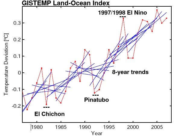
What happens if you make the time span of your trend line too short is clearly shown on this graphic :
This aren’t meaningful trend lines any more but Mikado. Shortening the time period to seven years naturally makes it even worse :
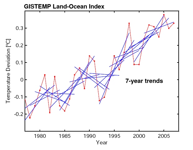
(El Chicon & Pinatubo are volcanoes which in the given years had major eruptions, causing a temporary global cooling effect which could be detected in the data set)
The last two images are taken from this article from the excellent website RealClimate and is well worth reading. With the explanation above, I hope even people with no scientific training are able to understand what’s written in the RC article.
If you want to read even more, I recommended these links :
Robert Grumbine on cherry picking
Maybe a bit more difficult, but still worth reading : statistician Tamino on ‘global warming stopped in 1988’ and the use of short term trends in this three posts :


